BURN SCAR PRO: Naming & Branding a Medical Solution
MADALYN MARIE CREATIVE
CONSULTING PROJECT
PROJECT
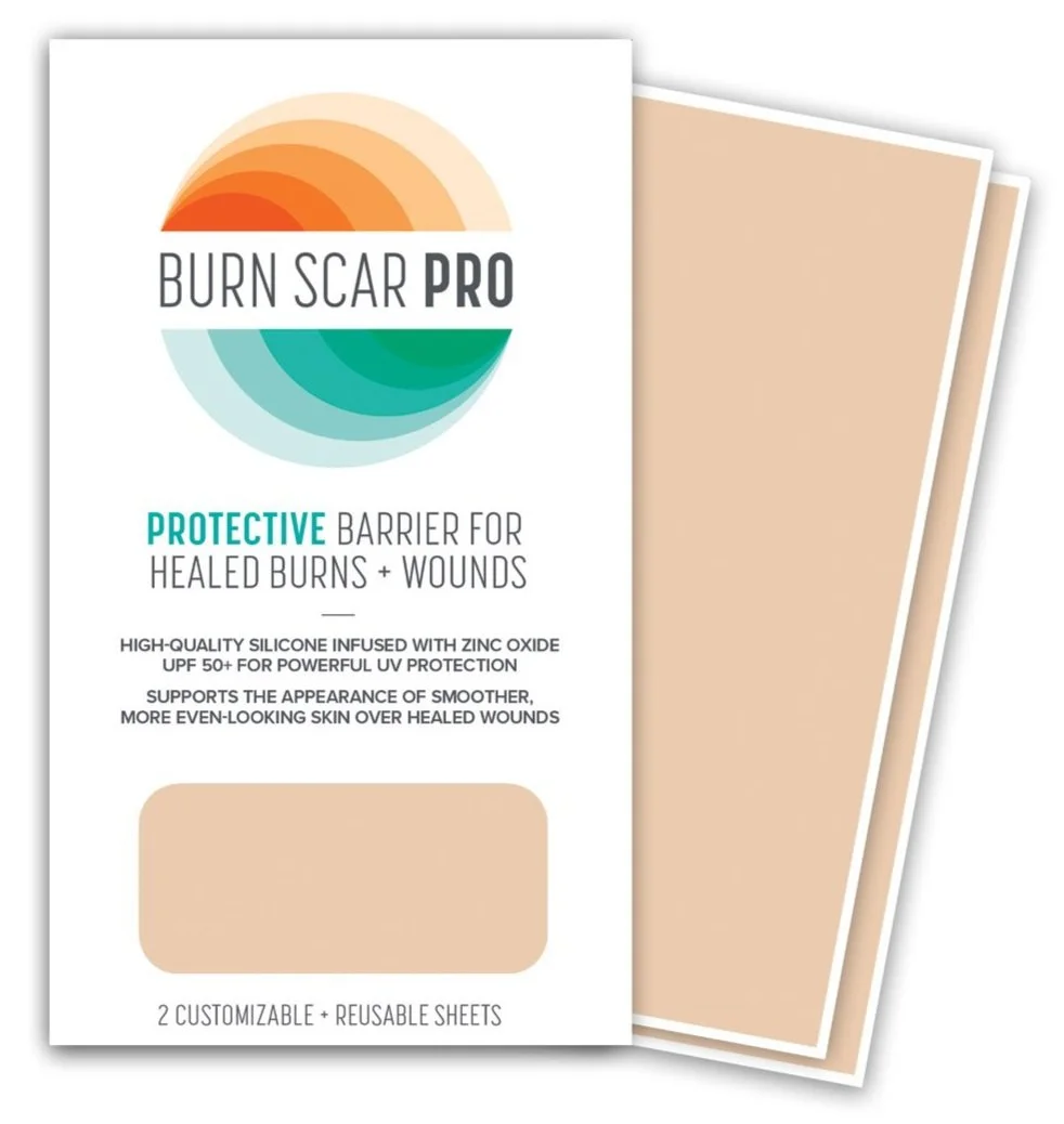
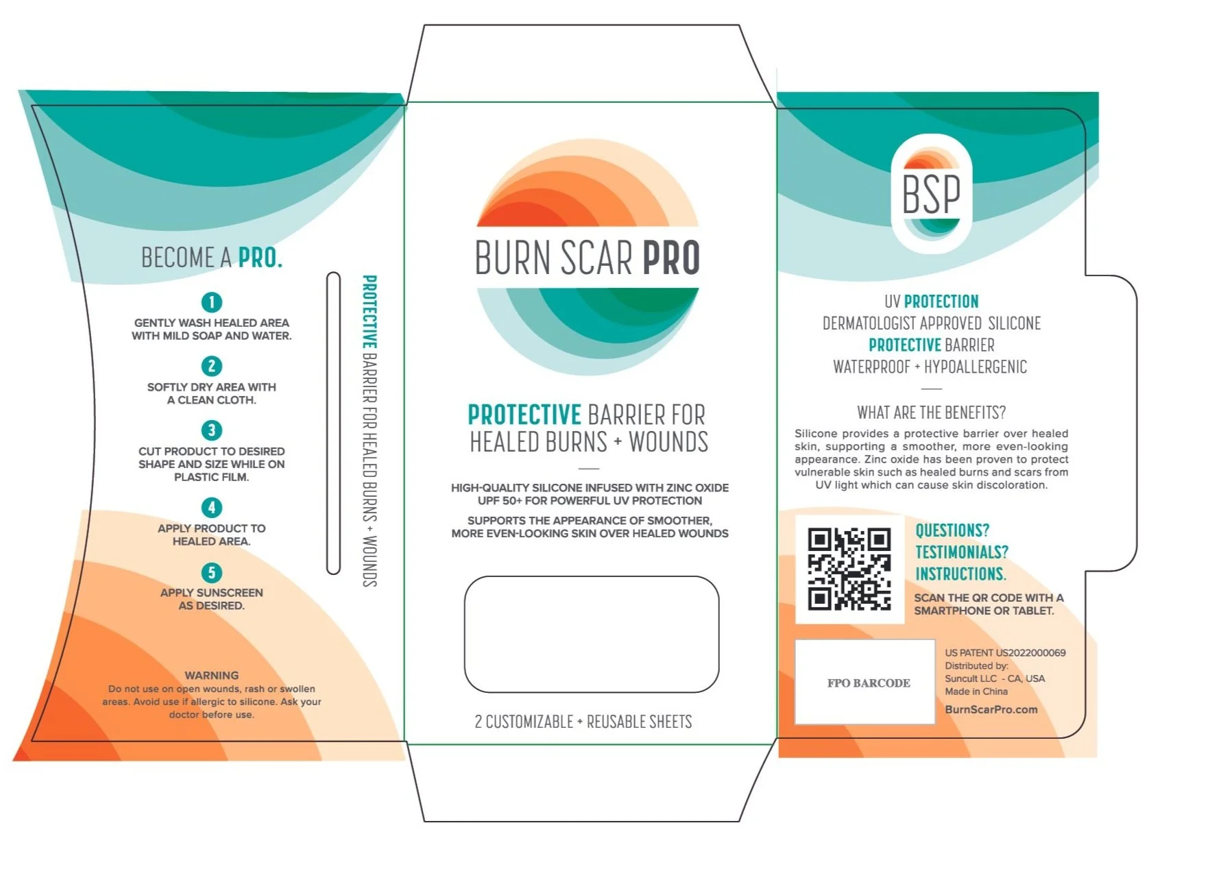
Burn Scar Pro is a clinical-grade medical product developed to support the healing and long-term visibility reduction of burn scars. I was engaged to create both the name and brand identity — a complete strategic and visual package designed to build immediate trust in a highly sensitive category.
NAME IDEATIONS
The name Burn Scar Pro was chosen for its clarity, searchability, and medical credibility. It communicates exactly what the product addresses while positioning it as a professional-grade solution. The term “Pro” signals expertise and efficacy — important for a product that supports users through both physical and emotional healing.
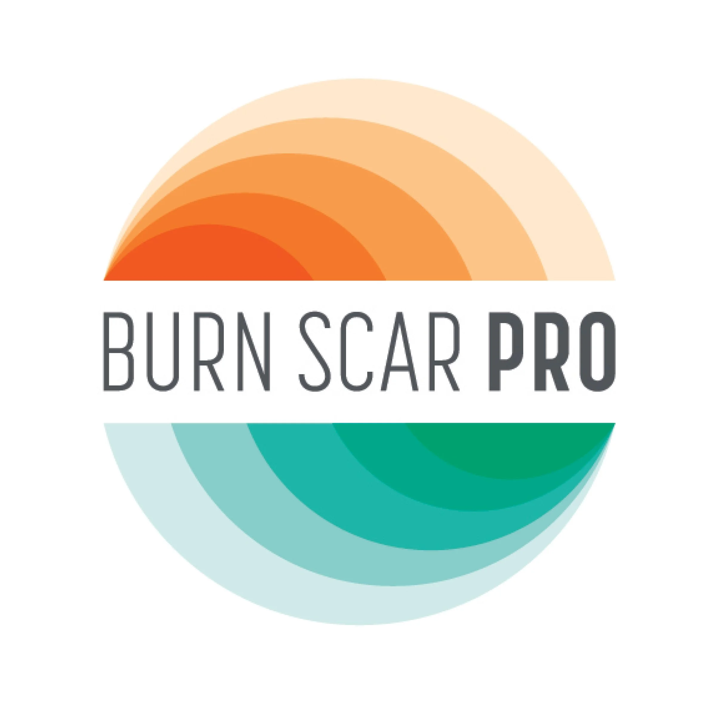
LOGO DESIGN & SYMBOLISM
The visual identity centers on a bold circular mark, split horizontally to symbolize duality: injury and healing, damage and renewal. The upper half, shaded in orange tones, references trauma — burns, inflammation, and scarring. The lower half, shifting to teal, reflects cleanliness, medicine, and recovery.
Within each half, concentric layers decrease in opacity and intensity, symbolizing the product’s core promise: visible scars fading over time. This gradation not only gives the logo movement and depth, but also metaphorically reinforces the journey from injury to restoration.
The result is a name and visual system that communicates efficacy, compassion, and professionalism. The brand is designed to stand out on the shelf while resonating with both medical professionals and individuals seeking long-term care for their skin.
Packaging Design